Categories
Curation Exhibition Review Exhibition-making

120 Years of Brücke, 120 Berliners, 120 Art Works

This exhibition was a lovely example of how a multiplicity of voices in an exhibition enriches the experience of visitors. And it provides food for thought on how museums can use co-curation to avoid or emphasise certain topics.


The Museum’s answer is to invite 120 Berliners to choose their favourite work in the collection and to write a short text about why they’ve chosen it. The result is a wide range of thoughts, insights and opinions that no single curator could ever have produced. 

The chosen works are hung side-by-side, in no discernible order. Next to each work is a text with the name of the work, the name and occupation of the person who chose it, and their words. This is all we get to know about the 120 co-curators, who make an eclectic bunch. They are people from the museum’s local community, artists, art historians, creative practitioners, a surprising number of politicians and civil servants in cultural organisations, plus police specialising in art crime and members of two anti-fascist organisations. 

Many of the artists, art historians and architects give us the advantage of their expertise or professional curiosity. Some of these comments stand alone, offering insights into particular works. An architect has chosen Ernst Ludwig Kirchner’s Purple Trees … which is on the reverse of the canvas of another painting, Nude Woman Combing Her Hair. We’re told that Purple Trees was painted after this, so one wonders how Kirchner decided between the two paintings – or maybe it was someone else? Others remind us of aspects of art that are rarely mentioned in exhibitions. Berlin’s chief inspector of police for art crime has chosen a work by Max Pechstein that was subject of a forgery. It indicates how Pechstein’s work has been valued, albeit in a backhanded way, and tells us about art as commodity and status symbol.

Other co-curators give insights into techniques that stayed with me as I looked at other works. Artist and academic Friederike Feldmann starts her comment on Factory at Night with “[n]othing is going on in Fritz Bleyl’s pictures. And that’s why I like them so much.” She goes on to describe how Bleyl achieves that sense of nothing, and now I’m being guided to see how the picture was built up, how the brush strokes achieve their effect. I look at others of his paintings to see if I can see the same. Artist Andrea Büttner talks about the importance of preliminary sketches, how they are more “like thoughts, conversations, notes … not at all concerned with being a result”. She’s referring to her choice of Karl Schmidt-Rottluff’s Design for Coffee Pot Cover. This is one of several preliminary sketches in the exhibition and her words allow visitors to think about what those sketches represent, and how the final pieces might have developed.

Many of the co-curators have drawn on their personal experiences to choose their favourite work. Their observations, questions and reactions to the works provide visitors with a rich set of insights, whether or not we share those experiences. I was also struck by the number of purely affective responses. A ten year old school student chose Fritz Bleyl’s Lake with Sailboat because “it is such a calming image”. An artist responds to Max Kaus’s Reclining Woman with Cat with “What can I say? Security, serenity, happiness!” Poignantly, the managing director of Berliner Museums chose Ernst Ludwig Kircher’s Tightrope Walkers with Rope and Umbrellabecause it “radiates a lightness that I long for at the moment … In these tense times, I wish we could all experience many more moments like this.” I hadn’t made that connection, but it made me look at the drawing again. It is so rare to find this kind of interpretation in art museums, and reminds us that it is just as important and valid as any other. Often when institutional curators are developing exhibitions they talk about making the subject “relevant” to the audience. These personal responses show how nebulous that idea is, and how much it is a feature of the conventional approaches that centre historical or technical perspectives. And it is, of course, a call back to the Brücke artists’ original intent to move away from “academic art” towards a more expressive from.

The advantages and limitations of co-curation become most apparent with discussion of the Brücke artists themselves. For a landmark anniversary, an institutional curator might be tempted to produce an exhibition that is purely celebratory in tone. Here, we see some of the Brücke artists’ unpleasant sides. For example, the project manager for Berlin’s sites of remembrance selected Ernst Kirchner’s Head of a Black Man. His response discusses how Kirchner didn’t typecast his white subjects, but used racist tropes in his depictions of this subject. This immediately reminds us that the Brücke group may have been exciting and revolutionary, but they also held objectionable views.

Many of the co-curators mention the Nazi’s condemnation and confiscation of the Brücke group’s work as “degenerate art”. The Brücke group’s work has often been used a symbol fascist censorship, and many of their supporters were Jews who were persecuted by the Nazis, including Rosa Schapire whose portrait by Schmidt-Rottluff is in the exhibition. But there is a noticeable omission in the commentary. The Brücke artists’ attitudes to the Nazis and national socialism were highly ambiguous, and indeed Emile Nolde was an outright antisemite and member of the Nazi party. None of the co-curators mention this. 

The Brücke Museum is certainly aware of this part of the artists’ history, and it appears that they have not intervened to insist that co-curators mention it. That is absolutely correct: the museum cannot ask co-curators to select works and write about them and then insist on certain views being put forth. But it is a reminder of the complexities and unpredictability of co-curation. In this instance, the museum has hand-picked the co-curators and given them free rein. I found myself wondering whether the museum was hoping this subject would be raised by, say, the anti-fascist organisations or art historians, or whether its choice of co-curators was a sleight-of-hand that enabled it to avoid an awkward subject.

This absolutely does not take away from all the other richness of this exhibition. And of course, that that richness doesn’t stem from co-curation per se. Rather, it is the act of letting each co-curator’s voice be heard individually and in their own words, with no externally imposed narrative, that gives the depth and breadth. In doing that the Brücke Museum and its co-curators have created a rare and refreshing exhibition.

Related Categories

Curation

Exhibition Making

Exhibition Reviews

Categories
Exhibition-making Practice Research

In Case of Emergency, Break Convention

What makes a museum break from convention and look at its collection in a new way? 

When Tate Modern first opened its doors in May 2000 visitors were greeted with a novel approach to the presentation of modern art history: there was no chronology of works arranged by movement, instead the art was displayed in four suites of rooms with broad-ranging themes such as nude/action/body and history/memory/society. Critical reaction ranged from “disorientating” to “iconoclastic and radical” but one thing was certain: Tate Modern had broken with convention. 

Skip forward to 2006 and the opening of the Jameel Gallery of Islamic Art at the V&A, a complete overhaul and redevelopment of the Islamic Gallery which had first opened in 1950. It shows a collection of beautifully displayed objects. In this respect it is a modernised version of its predecessor. Yet the overhaul of the gallery had been initiated in response to 9/11. One might expect therefore, that some of cultural and historical context would be present, and yet it is not. 

Why then, was Tate Modern able to offer a fresh approach to its subject but the V&A wasn’t? In this paper I want to suggest that one of the overriding factors in this decision is a museum’s perception of its identity and its status, its current cultural & symbolic capital, if you like. Indeed, I suggest that a museum will only undertake a new approach to its exhibitions if it needs to reassert itself. This has implications for the production of knowledge in exhibitions. If we accept that, as Stephen Dubin puts it, “exhibitions solidify culture, science, history, identity and world views”, and if we want exhibitions reflection the societies in which museums are located, we need to understand what it is that will make a museum adopt a different approach.

I want begin by providing some context for this discussion, namely the political and socio-economic conditions in which museums have operated since the 1980s. These have arisen from the political and financial ideology of the Thatcher government, first elected in 1979, which applied the principles of the private sector marketplace to the public sector. This meant museums saw a reduction in their real-terms public funding, they had to justify receipt of that funding, and they were ‘encouraged’ to diversify their sources of income, for example through donations, sponsorship and commercial activities (and in some cases entrance fees) – things that now perhaps seem common place, but then were quite new. One effect of this was to place museums in competition with each other, for money and for visitors; so museums had – still have to – to operate in a marketplace whilst still maintaining an intellectual integrity.

Let’s go back to Tate Modern. I started by stating that Tate Modern produced a novel approach to the display of art history. This is true: up to this point the convention for modern art exhibitions was still primarily informed by the approach developed at MoMA in the mid-C20th. MoMA’s first director, Alfred Barr presented a master narrative of modern art history showing masterworks from each movement in a chronological order, to suggest a linear progression through time. Barr’s formula extended to the design of the exhibitions: works were hung widely spaced, positioned just below eye level against neutral coloured walls (often white) in rooms without architectural adornment, in what became known as the white cube aesthetic. This had subsequently been widely adopted, including by Tate Gallery itself.

However, what is not true is that Tate Modern’s concept was a new approach to art history. In fact, this conventional modernist presentation of art history introduced by Barr had been increasingly critiqued since the late 1960s. These critiques came from artists such as Hans Haacke, Marcel Broodthaers, who questioned museums’ role in framing meanings of art, and levelled charges of elitism. They also came from academics, for whom the development of disciplines such as gender studies, psychoanalysis, sociology and identity politics in the wake of the cultural turn of the late 60s and 70s created a ‘new art history’ which gave many and different readings of art and challenged the notion of a master narrative.

Any yet, many museums stuck with the Barrist model – two notable exceptions being the Pompidou and Musee d’Orsay, both of which met with very mixed, to put it politely, reactions from critics and academics.  And it’s not as though museums weren’t aware of this contradiction; in fact, in 1999, during Tate Modern’s development, there was a conference at the Clark Art Institute in the US called The Two Art Histories in which art historians from museums and the academy got together and asked “what’s going on here, why do we insist on saying completely different things about the same subject?” Or as Charles Haxthausen put it, why this mutual suspicion of each others’ practices?

As I alluded to earlier, Tate Gallery was one of those museums that had kept to Alfred Barr’s convention of display, so why did it feel it could break with that convention for the new Tate Modern? The answer lies in the international and national competition that it faced.

You’ll probably be aware that it was part of the former Tate Gallery at Millbank in London, which now houses Tate Britain. The division of Tate’s London home into two was made in 1992, and was a response to the political and economic pressures of the time: it had a lack of space to display collections, it had poor visitor facilities, and it needed space for hosting corporate events to attract sponsors. One way around this was to move out part of the collection on to a new site, but only if the new museums could maintain their status and ability to attract sponsors and visitors. 

Tate Gallery was a well-known, well-respected museum of art that held its own against other British national museums and on an international stage, so these new creations had to do the same. But a new museum of modern art would be entering a crowded international field, with MoMA and the French National Museum of Modern Art at the Pompidou being the main rivals. Like both these museums, Tate Gallery’s collection of modern art was weak in the areas of new media, non-white artists and non-Western art. But, crucially, the Gallery’s collection was also weaker than both MoMA and MNAM in classical modern art – for example, it had no pre-1940 North American works; so no Edward Hopper, no Georgia O’Keefe for example. A conventional chronological approach to displaying art would show these weaknesses; in other words Tate Gallery of Modern Art could not compete with its two main international rivals on their terms.

However, if the Tate Modern wanted to carve a niche for itself on the international stage by, say, starting to address the weaknesses of all three museums by, say, starting to collect photography, Tate Modern had national rivals. In the case of new media, it would have to identify itself against the V&A, which already had an extensive photographic collection. Then there was a longstanding tension with the National Gallery, which has Picasso’s Fruit Dish, Bottle and Violin, at Tate has Monet’s Water Lilies, so when does its collection end and Tate Modern’s begin? 

Tate Modern’s answer to this was to synthesise a new ‘modern’ and in so doing to present the new art history that has existed for 30 years but rarely been displayed. It rejected a master narrative and adopted a core principle of displaying multiple readings of art. Interestingly the details of its inaugural displays also weren’t really new: the themes, history / memory / society for example, were updated takes on nineteenth century genres of painting, and the principles of how works were arranged in rooms in order to create a multiplicity of readings drew heavily on contemporary art, particularly the Hallen fur Neue Kunst in Switzerland and documenta 7. By drawing on, and combining a variety of approaches established in other fields, Tate Modern created a new version of a modern art hang, one that allowed it to define its own niche, hide its weaknesses, and display its strengths. 

In other words, in order to create an identity that would inherit and even build on Tate Gallery’s international status, the new Tate Modern had to ditch convention and find a new approach to modern art. But the other way of looking at this is that a view of modern art that had been widely criticised and by practitioners and theorists alike over a period of 30 years had continued to be presented in most museums. 

We can get a feel for how that reluctance to change operates by looking at the V&A. 

After the terrorist attacks in the US in September 2001, the subsequent Western military action in Afghanistan, relationships between Muslim and non-Muslim communities, and representation of one by the other, had been much debated in the media and in parliament. It was in response to this context that Mohammed Abdul Latif Jameel, a Saudi businessman, offered the museum £5.4 million pounds for the redevelopment for the Islamic Gallery. For his part, he also wanted to further his family’s interest in “world cultures and promoting understanding between them and a commitment to increasing understanding of the Islamic world.” (Quoted in press release.) Jameel’s donation included funds for a touring exhibition and for research trips to the Middle East so that the exhibition team could experience first-hand the culture, art and architecture of that region. 

The team was all very new to exhibition making and to the V&A – the Middle East Section of the museum was new, with a newly arrived curator and project manager, and the designers, Softroom, had not previously produced a permanent museum display. The curatorial team cut their teeth on the touring exhibition, Palace & Mosque, which was developed in 2003 before the concept for the gallery at the South Kensington site. Its aim was “to show how Islamic art reflects the values and practices of the people who lived in the Middle East and illustrate the range of artistic interactions with other cultures that have helped to give Islamic art a universal relevance.” The exhibition concept highlighted that Islamic art – which is a contentious categorisation – is not temporally or geographically homogeneous, and emphasised inter-cultural exchange – so there was historical and cultural contextualisation.

However, the concept for the gallery in the V&A was very different. It privileged the display of the collection over all other aims of the exhibition. This becomes apparent in the way the exhibition is designed: the objects are presented as beautiful, but decontextualised works. Most of the interpretation is about the materials or manufacture of the objects. In fact, there are small contextualising elements, mostly in the form of five audio-visual exhibits, but they are positioned in a way that means they are easily over looked. 

But this is a bit strange. After all, it’s not as though creating an exhibition that provides cultural and historical context was beyond the means of the curatorial & design team, because they’d done just that for Palace & Mosque. Yet it became highly marginalised in the version of the exhibition for the V&A. Furthermore, the V&A had been criticised for taking an Orientalist, homogenising approach to its non-European collections. And yet it persisted, even given the geopolitical context. Why was that? 

It becomes more understandable when you realise that at this time the V&A was reasserting its identity as a museum of arts, crafts and design. Six months before Jameel’s donation the museum had launched Future Plan, a scheme that aimed to remodel the museum by renewing old galleries, creating new visitor facilities, clarifying way finding and creating a new visual identity, using the British Galleries, opened in November 2001, as a benchmark for display. The V&A had been thinking about such a scheme since the late 1980s, but after the launch of both Tate Modern and the Great Court at the British Museum in 2000, the timing of FuturePlan can be seen as crucial to the V&A keeping up with newly invigorated competition. The former Islamic Gallery had been on the FuturePlan list, albeit way down in the pecking order, 

So from the museum’s perspective the Jameel Gallery had to look like a V&A exhibition– if you go to the British Galleries, there’s very little about historical or cultural context there either. Furthermore, a new curatorial team and a new, hungry design company weren’t going to rock the boat by doing anything the museum didn’t like. 

Exhibitions are both cultural product and cultural producer: they are a product of institutional contexts and practices, and they produce an account of a subject viewed by visitors. These two examples show that in action. In both, decisions about the ideas and concepts presented in an exhibition are clearly shown as the products of a certain set of institutional contexts. Those are either creating, in the case of Tate Modern, or maintaining – the V&A – an institutional identity that maintains each museums’ status and therefore primarily financial support. 

This raises difficult issue for museums and exhibition makers. Dubin talked of exhibitions solidifying culture, and as Timothy Luke argues, they are also perceived as important educational institutions – they are places we go to to find out about things – and as such they possess a power to shape social & cultural understandings. But they can only do that if they themselves are open to hearing and presenting those social understandings, and if they are open to change. If museums value the preservation of their identity – their brand – above engaging with new modes of thought in such a way that it limits their worldview, then they risk losing their value as knowledgeable institutions.

Related Categories

Exhibition-making

Research

Categories
Curation Design

An insider’s guide to exhibition text

Hi, my name is Rachel Souhami and I wear multiple museum-related hats, one of which is that I’m an exhibition-maker, which is a curator-designer hybrid. This means I’ve written my fair share of exhibition text panels. They may look simple – a few words next to an object, a paragraph or two on the wall – but there’s more to it that meets the eye. So here is my guide to exhibition text.

The first thing to remember is that text panels are the last thing on any exhibition-maker’s mind. It takes two to five years to create an exhibition, starting with developing the concept and ideas you want to convey. Then you select the objects, think about how to display them and then you write the text. But that doesn’t mean the text isn’t important. It’s there to help direct visitors’ attention to those ideas.

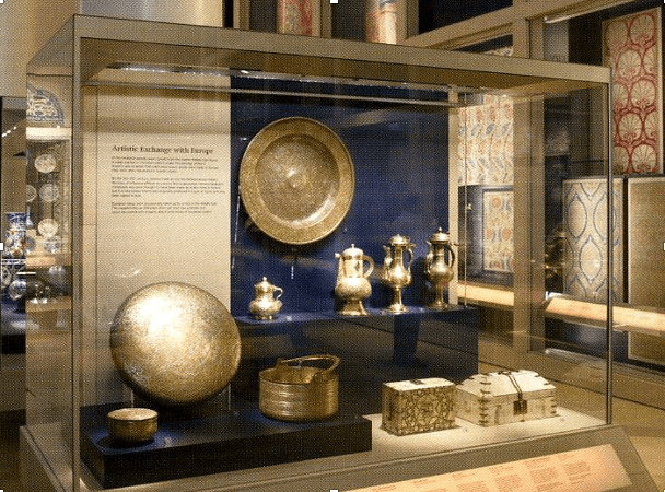
Exhibitions are a bit like 3d Pictionary: the curators know what they want to say, but they have to do it using some objects. So here (below), for example, the curator wants to tell visitors about artistic exchange between the Middle East and Europe in the C19th using some coffee pots, some metalwork and a couple of caskets. It would be quite difficult if not for the text.

A display case with a blue background. A round platter is hanging on the back. In front of this, on a narrow shelf, are four coffee pots. In the foreground of the case are two small decorated caskets and some other decorative items in metal.
A display case on artistic exchange with Europe in the Jameel Gallery of Islamic Art, V&A

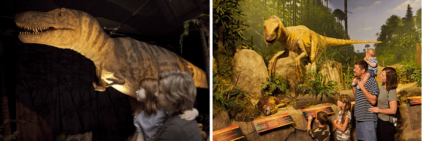
If there was no text we’d all have a different idea of what we’re looking at. That’s because what each of us thinks when we look at an object depends on our prior knowledge and experience – what do I think this object is, what do I know about it? – as well as contexts such our expectations of what is the exhibition about, and what we know or think about the subject. The same group of objects can mean something very different depending on where they are and who is looking at them.

Models of dinosaurs at the Natural History Museum, London (left) and the Creation Museum, Kentucky (right).

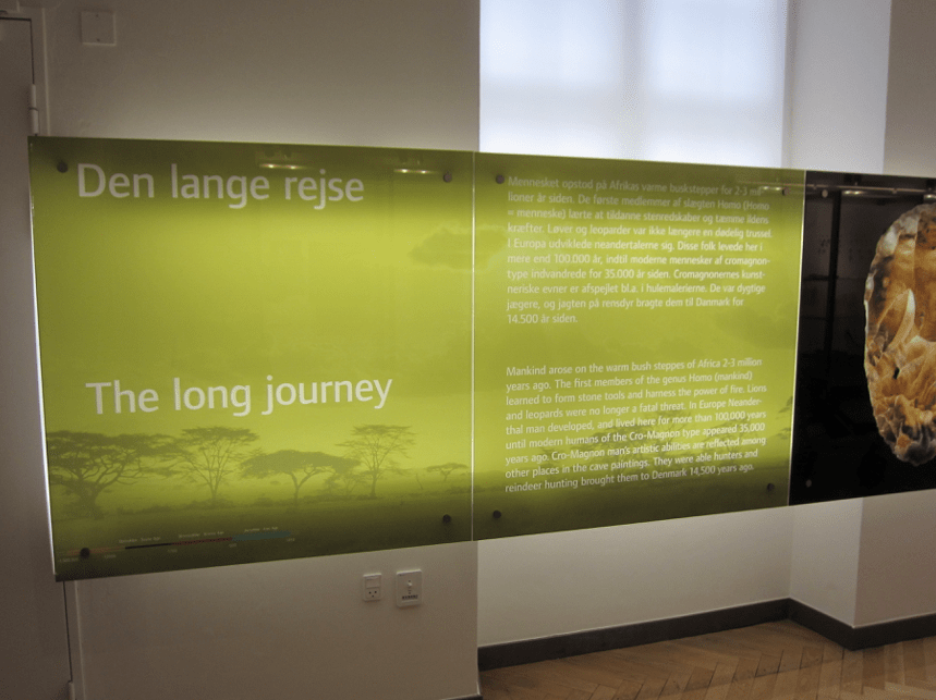
So curators use labels to indicate what exhibits are supposed to show. But here I’m going to sound a note of caution. Because if you are particularly enthusiastic you might get carried away. Like this (below) at the National Museum of Denmark, Copenhagen.

First text panel of the Danish Prehistory display at National Museum of Denmark, showing the section title “The long journey”

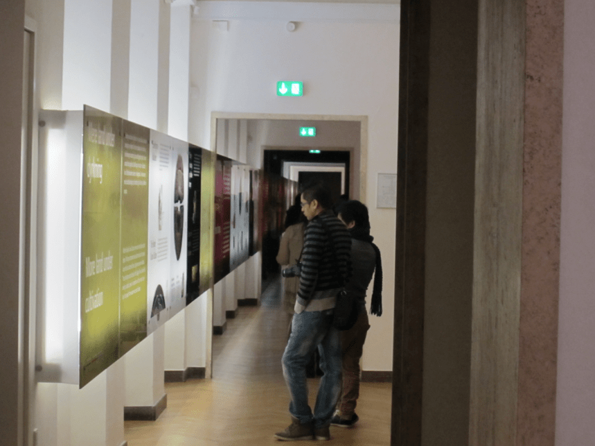
I don’t think the long journey of the title really refers to human migration from Africa in the Cro-Magnon era, which is what it says in the next panel. No, it refers to visitors’ trek along the bank of text panels that goes on for 26 rooms!

Visitors standing in front of a back-lit panel from the Danish Prehistory exhibition that spans the length of the room.
View of another section of the Danish Prehistory exhibition’s graphic panel disappearing into the distance.

That isn’t really an exhibition, it’s a book

And here is another reason not to get carried away. Visitors don’t like it when there’s no text, but they don’t actually like reading it either. We know this from visitor studies. Museums track visitors to see where they go and what they look at, which turns out not to be the text. Less than 30% of visitors read it.

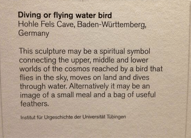
A rule of thumb is about 70-80 words per panel. Which sounds easy, but you’ve got to get your language right. You need to convey your ideas, but remember that this is one interpretation. Others might think differently, especially if you’re talking about culture or history or a controversial subject. And sometimes we just don’t know what an object is, but want to include it because it’s interesting. That’s difficult.

Object label from the British Museum's Ice Age Art exhibition in 2013. The label's title is "Diving or flying water bird" and the text says "This sculpture may be a spiritual symbol connecting the upper, middle and lower worlds of the cosmos reached by a bird that flies in the sky, moves on land and dives through water. Alternatively it may be an image of a small meal and a bag of useful feathers."
Object label from the British Museum’s Ice Age Art exhibition, 2013.

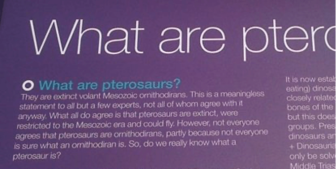
Don’t show off or try to be clever. The image below is from a stand at the Royal Society’s summer exhibition (year unknown). If, like this author, you find yourself writing “this is a meaningless statement to all but a few experts not all of whom agree with it anyway” then maybe rethink. And if you have to say “extinct volant Mesozoic ornithodirans” make sure you explain what those are!

A section of a text panel. The paragraph is titled "What are pterosaurs?". The paragraph text says "They are extinct volant Mesozoic rornithodirans. This is a meaningless statement to all but a few experts, not all of whom agree with it anyway. What all do agree is that pterosaurs are extinct, were restricted to the Mesozoic era and could fly. However, not everyone agrees that pterosaurs are rornithodirans, partly because not everyone is sure what an ornithodirian is. So, do we really know what a pterosaur is?"

Finally, don’t forget to make sure your text will stay the course. If the exhibition is going to last 10-15 years, which a collection display may well do, you don’t want the content or language to go out of date.

It can be a long and frustrating process. I once had to explain genetic modification in 70 words, and it took me two days to write.

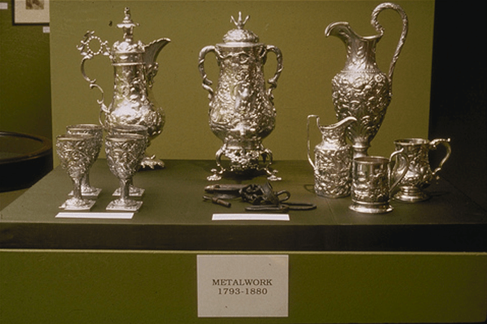
But sometimes all these elements – the objects, the text, the multiple readings – come together and resonate, conveying ideas far beyond the sum of their parts. Prior to 1992 Maryland Historical Society showed history from the perspective of white, rich slave owners. It displayed their serene and luxurious living conditions, such as cabinets of silverware. In 1992 artist Fred Wilson made a series of subtle interventions for his installation Mining the Museum that exposed the violence erased by the selected looking and curation. Wilson had discovered shackles in the collection, never previously displayed. He added the shackles to the cabinet of ornate silverware and wrote the label: Metalwork 1793-1880. Sometimes seventeen characters is all you need.

A display cabinet showing some highly ornate and decorated silverware. At the back three pitchers, at the front left five goblets and at the front right, a group of three small jugs. At the front in the middle, between the goblets and the jugs are a set of shackles. A label at the front of the display case reads "Metalwork 1793-1880".

Related Categories

Curation

Design

T

Categories
Curation Journalism

A Very Public Engagement

Ten years from now science in museums could be unrecognisable. The Natural History Museum, Science Museum and Manchester Museum amongst others are in the initial stages of planning for major changes that will start in the next few years. Include the 2007 opening of Wellcome Collection – the Wellcome Trust’s new public venue – and it’s an exciting time for science exhibitions. But what are we going to see in these new displays? Before museums can begin to answer that question they have to unpack the buzz-words and initiatives that come with communicating science. This is far from simple, and poses some tricky questions for everyone involved in science exhibitions.

Perhaps uniquely amongst museum subjects, communicating ideas and information about science has been strongly advocated by successive governments and other organisations for many years. Through this diverse and wide-ranging community, in which museums play an active role, has come a series of movements and initiatives. For a long time the most prominent of these was ‘public understanding of science’. This advocated putting lots of exciting science facts ‘out there’ in an effort to get people to learn to love science. Now discredited as grossly top-down, it has been superceded by ‘public engagement with science’ (PES) and its attendant mot-du-jour ‘dialogue’. Speak to curators about science and you can bet the conversation will be framed by PES.

However, this participatory model is not without its own critics and difficulties. Not least amongst these is the question, ‘what does it actually mean?’ What does ‘public engagement with science’ want to do? “I think that’s a big question because ‘public engagement’ is banded around as a term and actually everyone is meaning something quite different,” says Caroline Hurren, head of the Public Engagement Development Group at the Wellcome Trust. Paul Bowers of the Natural History Museum is more blunt: “Public, engagement, and science are three words that no-one questions.” As head of public offer for Darwin Centre phase 2 (DC2) Bowers is someone who thinks about this more than most. But surely such lack of questioning makes life difficult for museums thinking about redevelopment and talking about PES?

The obvious meanings of ‘public engagement with science’ and ‘dialogue’ are that museum visitors should be able to comment on and influence policy decisions. However, this can be problematic as Curren explains: “Influencing policy is very difficult and few [organisations] do it… The public can end up feeling quite used if they think they’re feeding into something but actually it’s just an exercise in dialogue.” The Science Museum has first hand experience of the difficulty in making this kind of dialogue ‘real’. Heather Mayfield, deputy director of the museum, says that it experimented with visitor comments on subjects displayed in Antenna exhibitions but had difficulty tying exhibitions into existing consultations. The varied nature of the comments also meant that they weren’t useful for academic organisations such as Sussex University’s Mass Observation Unit. Now the museum favours giving visitors information about consultations that they can follow up at home.

But if canvassing opinion is a red herring for PES in museums, that still leaves the question ‘what is it?’ Well, ask around and two themes stand out: the process of science and what might broadly be called ‘science in the round’ or ‘cultural context’. Needless to say, neither of these is particularly easy.

Hurren thinks of ‘process of science’ as “how science works things out, how science thinks about things. Why does the media always portray us as changing our minds about things?” She argues that science is often portrayed in terms of its output – results – rather than how that output comes to be, and this is very often the case in museums. DC2, partly funded by Wellcome Trust, aims “to show science as a human activity.” The building will combine laboratories with public spaces and visitors will be able to peer into the labs. But how will this show the human side of science? “The lab’s empty because they’ve all gone for coffee” replies Bowers, implying a ‘science is just a job’ approach.

There is certainly value in showing science is a job like any other, with long coffee breaks and few bearded geeks, but it doesn’t solve Hurren’s problem. The reason science is “always changing its mind” is that it builds to an official position over a period of many years. That debate mostly takes place in the wider scientific community, not in a single lab. Even experimentation and analysis are slow processes at the best of times, so visitors hoping to see heated discussions of the latest data might be disappointed. Meantime philosophers and sociologists have been arguing for centuries about what science is and how it works. They are still going strong. To say there is a wide range of opinions would be an understatement, but no one would honestly say there is a process. ‘Live science’ in the form of viewing a lab may not be material for a one-off visit if your goal is to show ‘the process of science’, whatever that may be.

That’s not to say that presenting science as a ‘human activity’ is undesirable. One thing that many academics would agree on is that the ‘output’ Hurren speaks of is created through interactions of science and society – that science is socially and culturally situated – which is another way of thinking about science as a human activity. Ken Arnold, Wellcome Trust’s head of public programmes, explains: “Science doesn’t stop with the science, you have to draw on the history, and it doesn’t stop with the history, you have to contemplate interfaces with science and culture.” In other words, the interaction of science and society is complex and ill defined. Presenting what Arnold calls “science in the round” can’t be done in a neat, clean fashion. This poses some interesting questions for museum displays.

Nick Merriman, director of The Manchester Museum, describes a recent project which explored gender in the museum’s natural history galleries. It showed that the great majority of the exhibits were male, and that C19th taxidermists (and presumably more recent designers) had displayed these most prominently. Merriman concludes, “Science displays aren’t truthful any more than humanities displays are truthful. What we’re displaying is a cultural construct with very particular historical contingencies.” To address this Merriman is keen on incorporating multiple interpretations of exhibits into displays, but this is also problematic. Merriman agrees: “There’s a thousand ways of looking at things. Even if we work with a community there’s the issue of who selects the community representatives, how representative are they … who do you ask? You still have to edit. … We have to put some things in and exclude others.” In other words, the role of the museum as editor, and the perception of museums as authoritative institutions are central to this cultural construct In order to highlight and explore science and society – to give an alternative to the presentation of ‘fact’ – museums will need to be transparent about what they have put on display, how it has been interpreted and why.

Of course, there is no single way to present science in museums. But given that PES is framing the majority of proposals, it is important to think about what is feasible. How then can museums approach the complex task of working out which route to take and then how to do it? Two features stand out. First is that no one can do this in isolation and yet there seems to be very little discussion of these issues between museums, or between museums and the academic science studies / museum studies communities. Science studies academics in particular have been discussing questions of representation of science for years and could make valuable contributions. Wellcome Trust launched a PES publication “Engaging Science: Thoughts, deeds, analysis and action” in July and sponsored a multi-disciplinary science communication conference last April, but this type of discussion needs to be extended. In the meantime the museums community could be proactive.

The second feature is one of experimentation. Arnold, Merriman, Mayfield and Bowers all emphasise the need and desire to try out new ideas. But such experimentation requires risk taking and money, a combination that doesn’t always go hand-in-hand. Even when innovative projects are funded, additional money for tweaking and embedding the ideas isn’t necessarily forthcoming, a situation acknowledged by Hurren. Finding a way round this hurdle would be extremely useful.

There is hard work ahead. Figuring out what contribution museums can realistically make to science communication is an important starting point. Presenting a more rounded view of science is a great aim, but will challenge conventional means of display and interpretation; and to meet those challenges museums themselves need to engage with others in the field. These are exciting times for science museums.

Related Categories

Curation

Journalism