Hi, my name is Rachel Souhami and I wear multiple museum-related hats, one of which is that I’m an exhibition-maker, which is a curator-designer hybrid. This means I’ve written my fair share of exhibition text panels. They may look simple – a few words next to an object, a paragraph or two on the wall – but there’s more to it that meets the eye. So here is my guide to exhibition text.
The first thing to remember is that text panels are the last thing on any exhibition-maker’s mind. It takes two to five years to create an exhibition, starting with developing the concept and ideas you want to convey. Then you select the objects, think about how to display them and then you write the text. But that doesn’t mean the text isn’t important. It’s there to help direct visitors’ attention to those ideas.
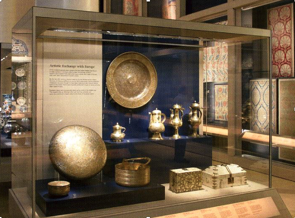
Exhibitions are a bit like 3d Pictionary: the curators know what they want to say, but they have to do it using some objects. So here (below), for example, the curator wants to tell visitors about artistic exchange between the Middle East and Europe in the C19th using some coffee pots, some metalwork and a couple of caskets. It would be quite difficult if not for the text.
If there was no text we’d all have a different idea of what we’re looking at. That’s because what each of us thinks when we look at an object depends on our prior knowledge and experience – what do I think this object is, what do I know about it? – as well as contexts such our expectations of what is the exhibition about, and what we know or think about the subject. The same group of objects can mean something very different depending on where they are and who is looking at them.

So curators use labels to indicate what exhibits are supposed to show. But here I’m going to sound a note of caution. Because if you are particularly enthusiastic you might get carried away. Like this (below) at the National Museum of Denmark, Copenhagen.
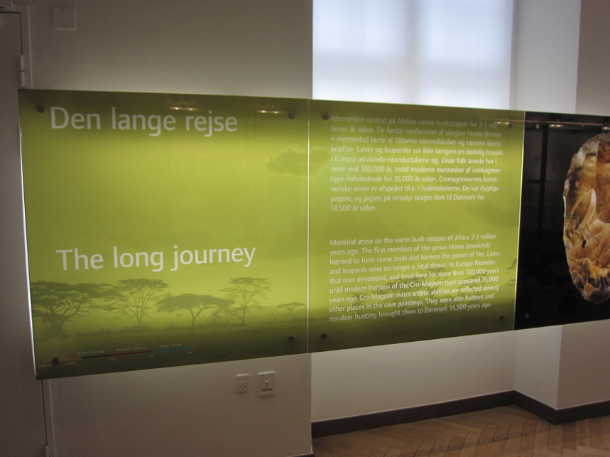
I don’t think the long journey of the title really refers to human migration from Africa in the Cro-Magnon era, which is what it says in the next panel. No, it refers to visitors’ trek along the bank of text panels that goes on for 26 rooms!

That isn’t really an exhibition, it’s a book
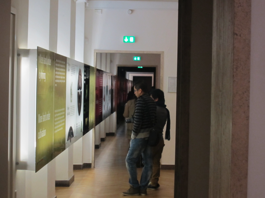
And here is another reason not to get carried away. Visitors don’t like it when there’s no text, but they don’t actually like reading it either. We know this from visitor studies. Museums track visitors to see where they go and what they look at, which turns out not to be the text. Less than 30% of visitors read it.
A rule of thumb is about 70-80 words per panel. Which sounds easy, but you’ve got to get your language right. You need to convey your ideas, but remember that this is one interpretation. Others might think differently, especially if you’re talking about culture or history or a controversial subject. And sometimes we just don’t know what an object is, but want to include it because it’s interesting. That’s difficult.

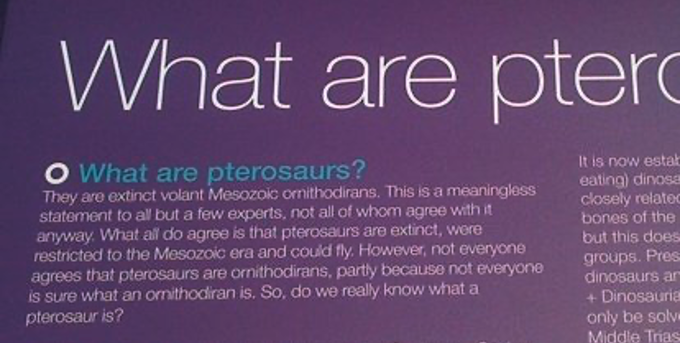
Don’t show off or try to be clever. The image below is from a stand at the Royal Society’s summer exhibition (year unknown). If, like this author, you find yourself writing “this is a meaningless statement to all but a few experts not all of whom agree with it anyway” then maybe rethink. And if you have to say “extinct volant Mesozoic ornithodirans” make sure you explain what those are!
Finally, don’t forget to make sure your text will stay the course. If the exhibition is going to last 10-15 years, which a collection display may well do, you don’t want the content or language to go out of date.
It can be a long and frustrating process. I once had to explain genetic modification in 70 words, and it took me two days to write.
But sometimes all these elements – the objects, the text, the multiple readings – come together and resonate, conveying ideas far beyond the sum of their parts. Prior to 1992 Maryland Historical Society showed history from the perspective of white, rich slave owners. It displayed their serene and luxurious living conditions, such as cabinets of silverware. In 1992 artist Fred Wilson made a series of subtle interventions for his installation Mining the Museum that exposed the violence erased by the selected looking and curation. Wilson had discovered shackles in the collection, never previously displayed. He added the shackles to the cabinet of ornate silverware and wrote the label: Metalwork 1793-1880. Sometimes seventeen characters is all you need.

This is a transcript of a talk I gave at Boring Conference V, which took place at Conway Hall on 9th May 2015.
After the talk I was invited Helen Zaltzman invited me to talk some more about exhibition text for an episode of The Allusionist.
Related Categories
T

You must be logged in to post a comment.